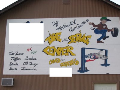
 Operererererated! It was difficult to find this error because it is difficult to read this sign. It looks as though the "i" in service was an afterthought. (You may have to click on the picture so that you can see an enlarged view in order to read the words.)
I saw this sign last week!! If you knew the owner, you might understand.....he isn't the brightest color in the box.
ReplyDeleteI wonder if it was supposed to look like graffiti. But graffiti is hard to read, so why would you want the sign advertising your business to resemble it?
ReplyDeleteI take issue with billboards along the highway that are too small to read... or that have the slogan much larger than the name of the business. Just put your name as big as you can on the billboard and people will clamor to figure out what the product is.
BentOnBenton